Table of Contents
- What Is a Checkout Page?
- Why Is the Checkout Page Important?
- What You Should Do for Payment Page Optimization
- 1- Minimize Page Transitions on Your E-commerce Site
- 2- Design the Checkout Page User-Friendly
- 3- Ensure Your User Operates Within the Visible Part of the Screen
- 4- Always Inform Your Users
- 5- Fulfill Legal Disclosure Obligations
- 6- Allow Visitors to Shop Without Registration
- 7- Offer Various Payment Options
- Conclusion
Today, one of the key factors behind the popularity of online shopping is the availability of various products and services at any time, along with customers’ ability to quickly compare prices. One of the most critical elements that simplifies online shopping processes is the payment step. The smooth operation of the payment step is among the top factors that enhance the shopping experience for customers. Of course, for businesses, this means conversion, in other words, revenue. How should the checkout page be designed for consumers to complete the purchase process? In this article, you can find tips on payment page designs that will increase your business’s conversion rate.
What Is a Checkout Page?
A web page that allows users to make online purchases by entering their payment information from any device is called a payment page.
From the perspective of e-commerce processes, the checkout page, which is a critical element, also plays an essential role in enabling businesses to provide a good shopping experience to users. Therefore, many companies of various sizes should pay attention to payment step optimizations in online shopping.
Why Is the Checkout Page Important?
In recent years, research conducted on 48 leading e-commerce sites worldwide revealed an average cart abandonment rate of 69.99%. In other words, almost 70% of shopping carts are abandoned before the purchase is completed.
Checkout page optimization needs to be done more efficiently or in a more complicated manner to affect the customer experience positively. The better the checkout page is designed to match the customer experience, the higher the conversion rate e-commerce websites achieve.
What You Should Do for Payment Page Optimization
Experts estimate that conversion rates can be increased by 35.62% by implementing checkout page optimization strategies. So now, let’s examine the tips you need to know to structure the payment page to match the customer experience:
1- Minimize Page Transitions on Your E-commerce Site
Online shopping processes consist of three main steps: The page containing cart details, containing shipping and billing information, and the checkout page. As the number of required steps for completing a purchase increases, the error rate at each stage also rises, leading to an increase in cart abandonment.
In other words, you must ensure your customers can easily and quickly reach the payment step to place their orders.
2- Design the Checkout Page User-Friendly
The payment page should be designed clearly and simply. This rule applies to all pages on e-commerce websites. Therefore, page designs that consider user behaviors should be preferred.
In this respect, elements that distract users from the shopping process should not be included. Images and links that lead users out of the shopping steps should be removed.
If there are certain notifications you want to display, such as campaign announcements or gift coupons, it is preferable to use pop-up displays on the current page. This way, users will stay within the payment page, increasing the likelihood of completing their purchase.
Another factor that can negatively impact the user experience is the loss of information users enter when transitioning between steps. Users’ information should be preserved when they move to previous or subsequent stages. This can be easily achieved through cookies on your website. As a result, users can complete their shopping more easily without re-entering their information.
3- Ensure Your User Operates Within the Visible Part of the Screen
It is important that users can complete the entire shopping process on the visible part of the screen. This is because the most prominent and clicked parts of the page are the ones within the visible part of the screen.
As you scroll down to the bottom of the page at any step, the visibility and click rates decrease. Therefore, providing all content within the visible boundaries of the screen can be beneficial.
4- Always Inform Your Users
Another point to consider in e-commerce processes is that your users know at which stage they are at all times. You should show this in your website design. Thus, users can see at which stage they are and estimate when they can complete the order. A progress indicator can help users know where they are in the process.
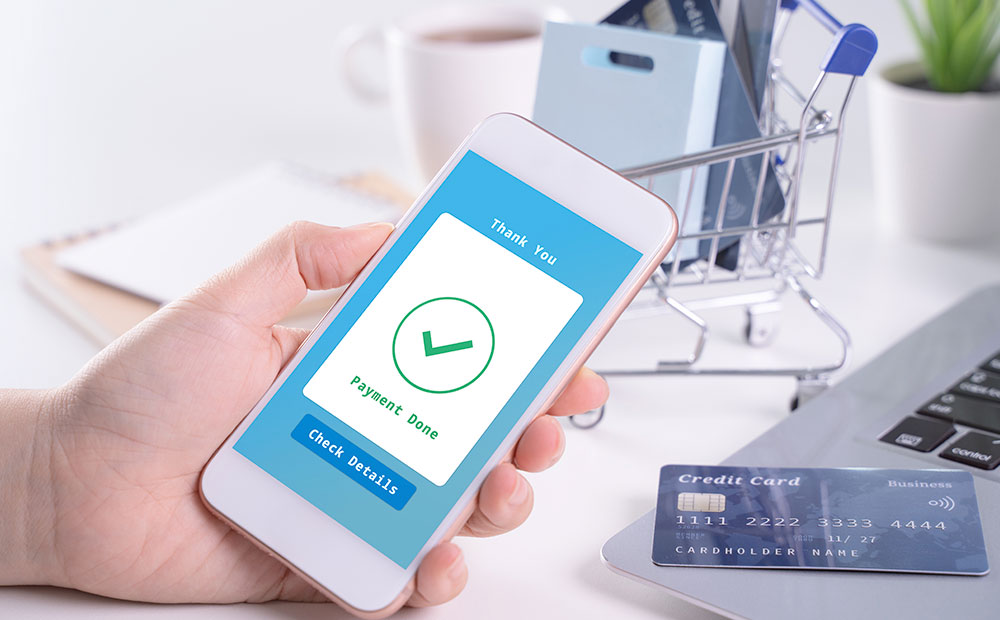
Additionally, after the payment is completed, a notification screen should be displayed to inform the user that the order has been placed. Sending real-time notifications about delivery processes can also positively affect the customer experience.
5- Fulfill Legal Disclosure Obligations
Distance sales agreements and preliminary information forms related to this agreement must be available on payment pages. This agreement, which includes company and customer information, regulates the rights of your customers, such as returns and cancellation policies, as well as your responsibilities. Before online payment, this agreement and information form must be presented to the customer and approved.
6- Allow Visitors to Shop Without Registration
The membership system is a significant factor in terms of customer loyalty. Today, many businesses are developing membership systems for reasons such as creating unique customer campaigns or conducting various marketing activities. However, the membership system that offers multiple advantages to visitors may be different from the preference of every customer. For this reason, customers should be allowed to make payments without registering.
7- Offer Various Payment Options
In today’s world, where speed and convenience are crucial due to technological advancements, users’ payment preferences have also transformed. Users now expect more payment options to be available during the payment process. Therefore, businesses need to meet these expectations by offering different payment methods alongside credit card payments. Users prefer brands with multiple payment options, such as pay by link, QR code, or alternative payment methods.
Conclusion
According to statistics, approximately 7 out of 10 shoppers abandon shopping carts. However, by taking the proper steps, it is possible to reduce this rate and increase conversion rates.
In this article, we’ve highlighted the importance of checkout page optimization and provided tips for designing an optimized payment page.
By implementing these methods, you can provide your visitors with a better shopping experience in the long term, increase your business conversions, and build stronger brand loyalty.


